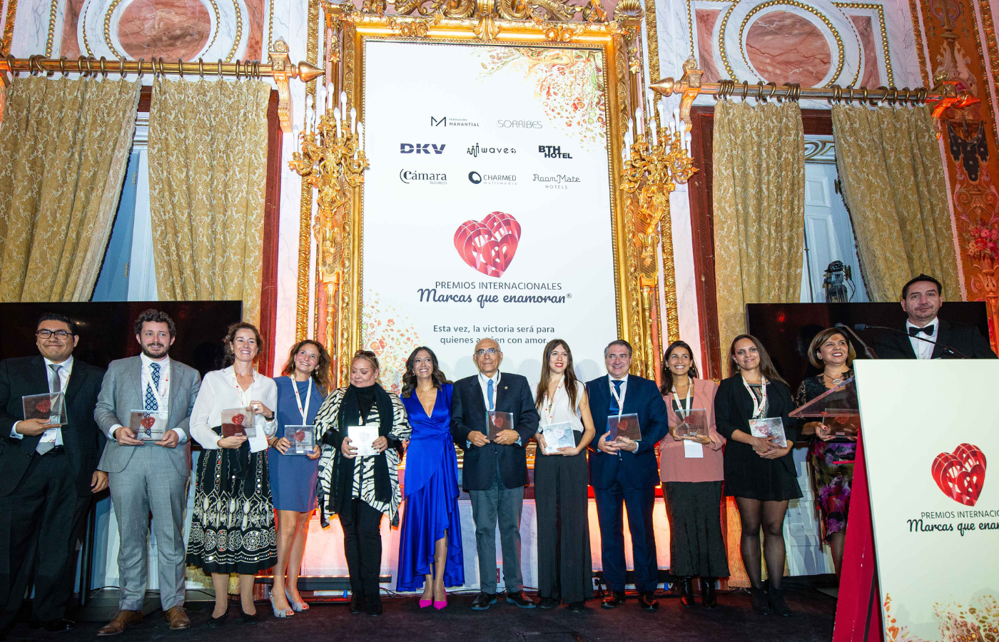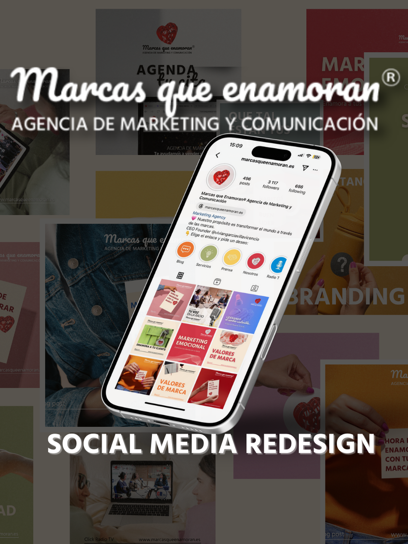
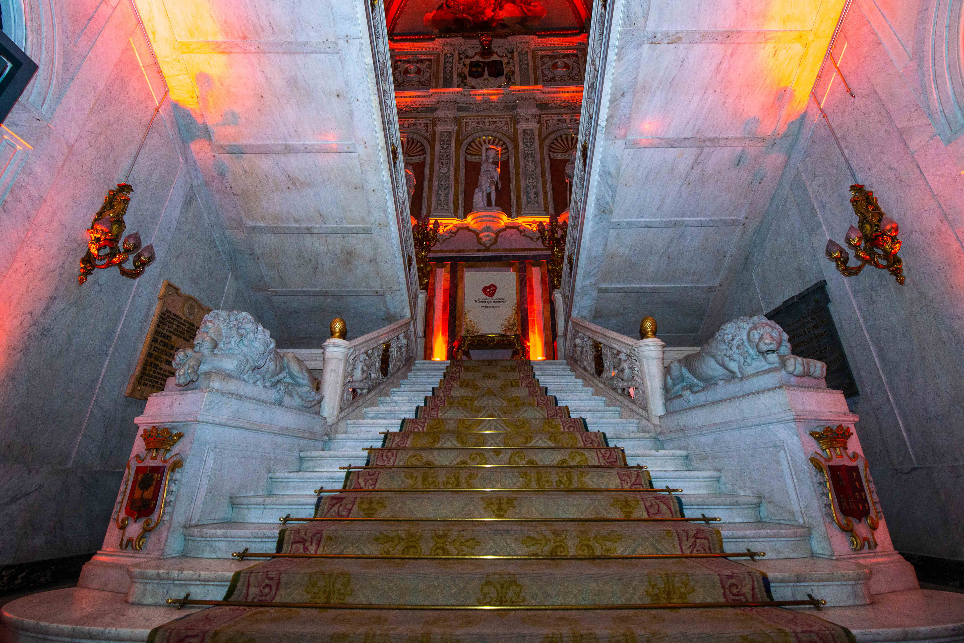
The primary objective was to produce a contemporary design that harmonizes with the prevailing style of the space. To accomplish this, I employed cream, orange, and gold hues to create a design that blends tonally with the other artworks. Additionally, our team drew inspiration from the blossoming of a tree. Awarding Businesses that creats fresh, new projects that cause a positive impact on the world was the main objective of the whole award ceremony, therefore, including some green tones just seemed like the right decision.
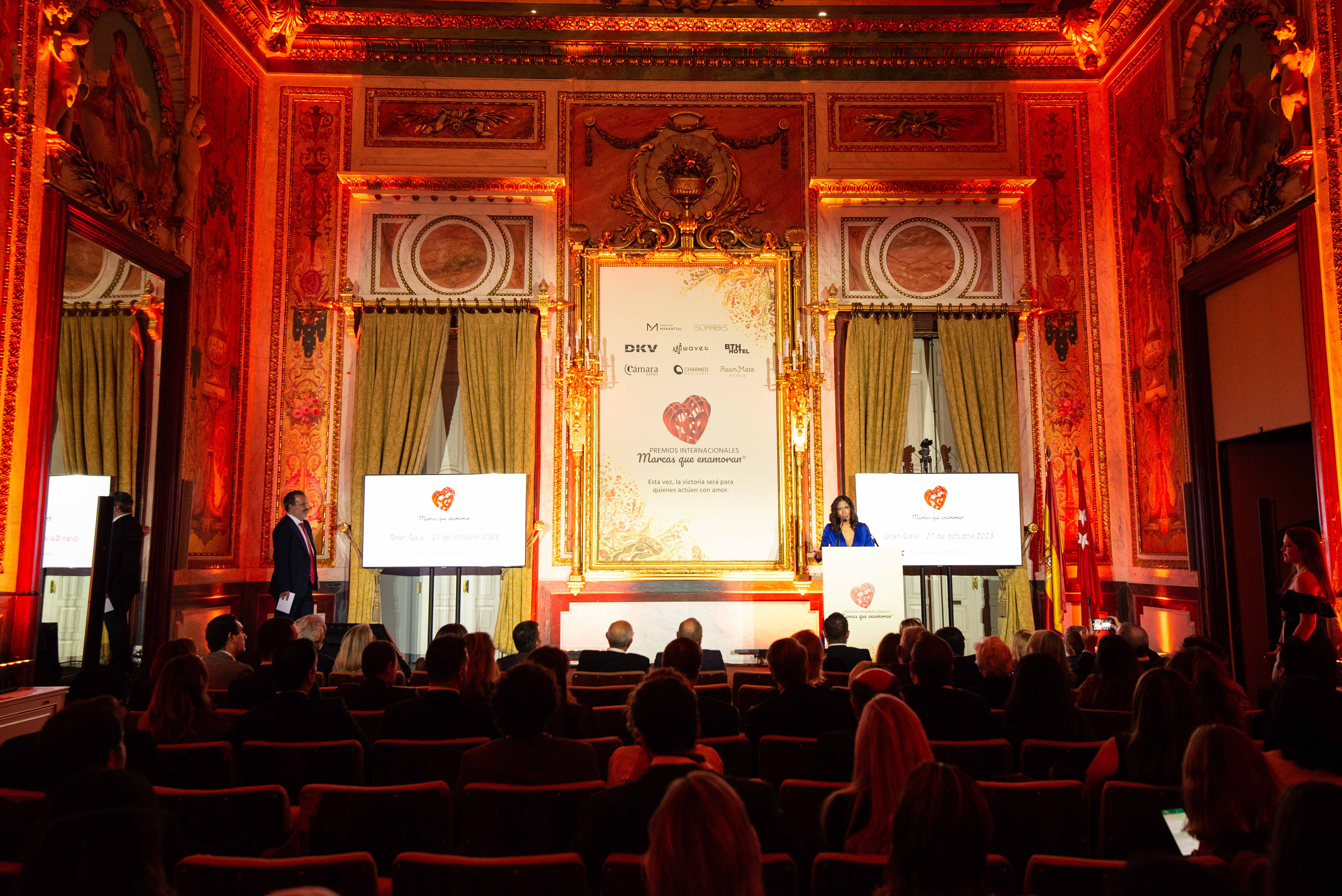
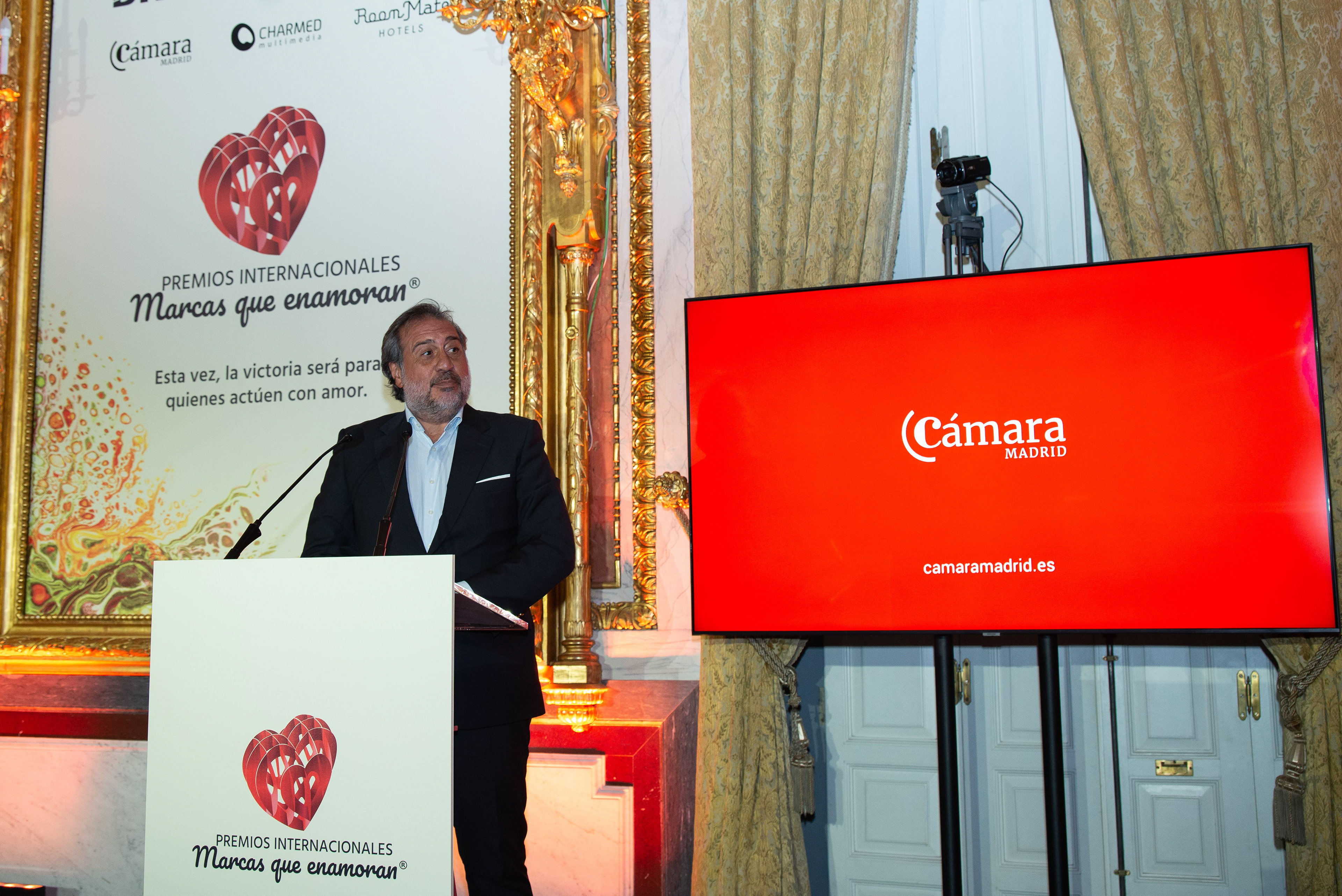
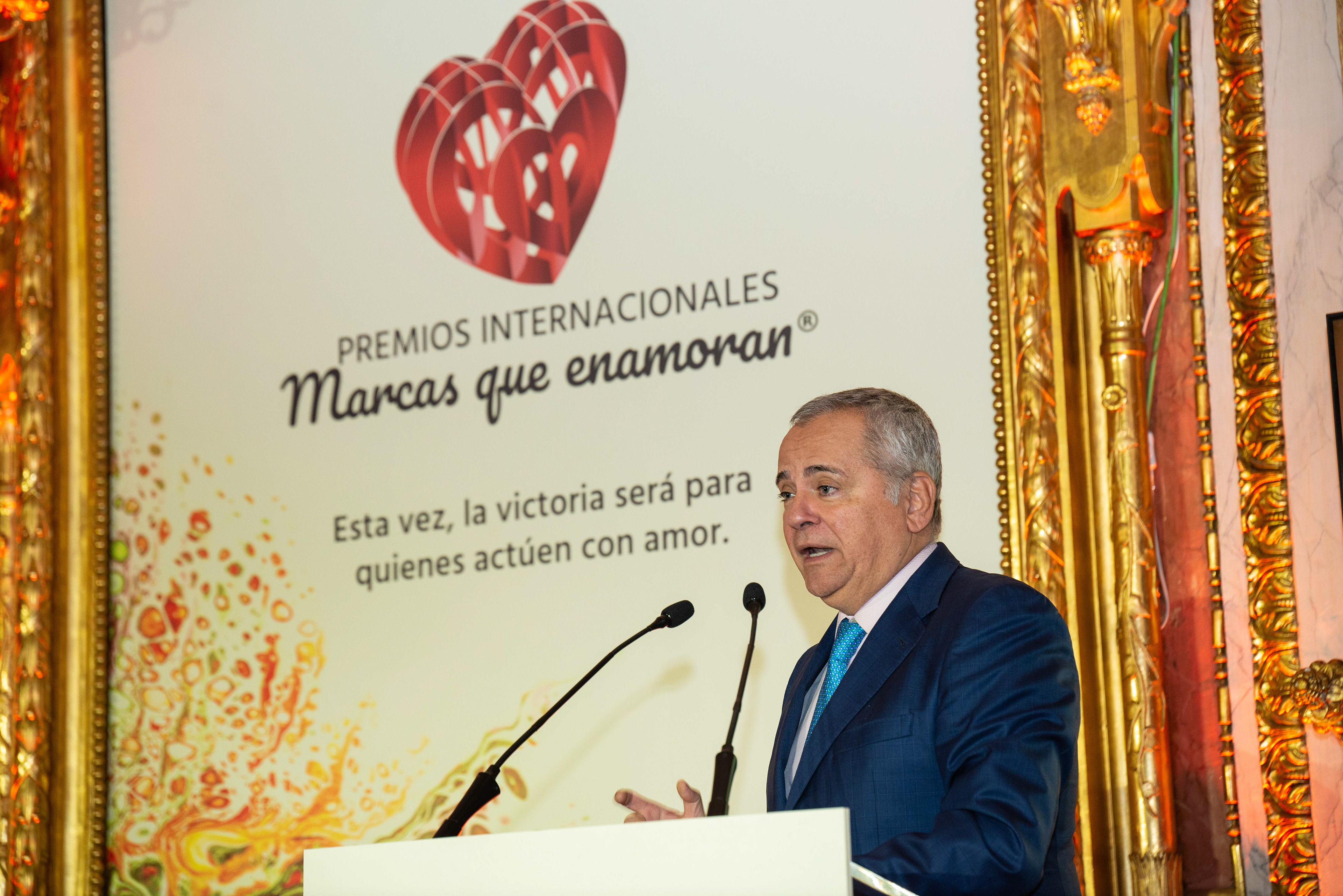
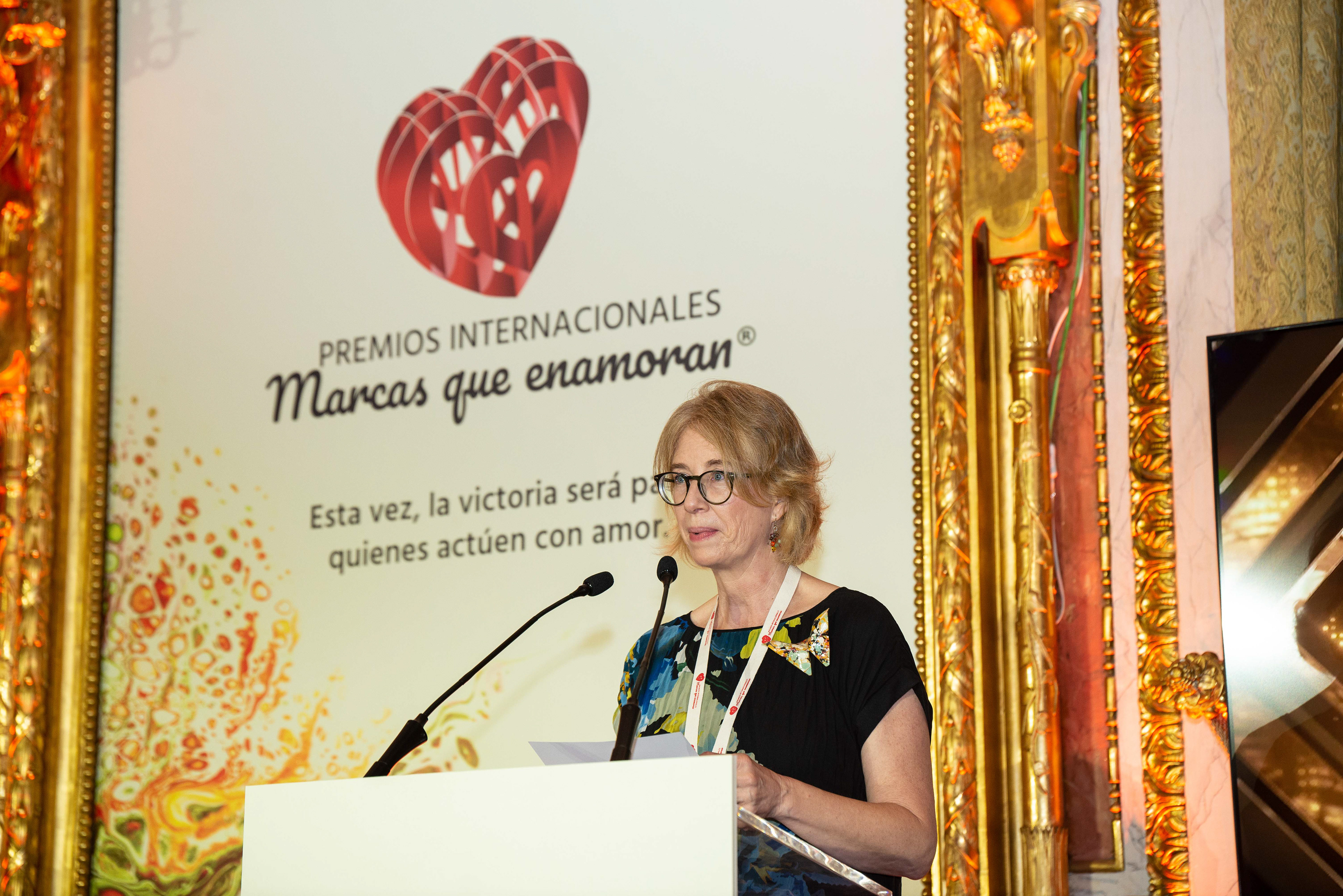
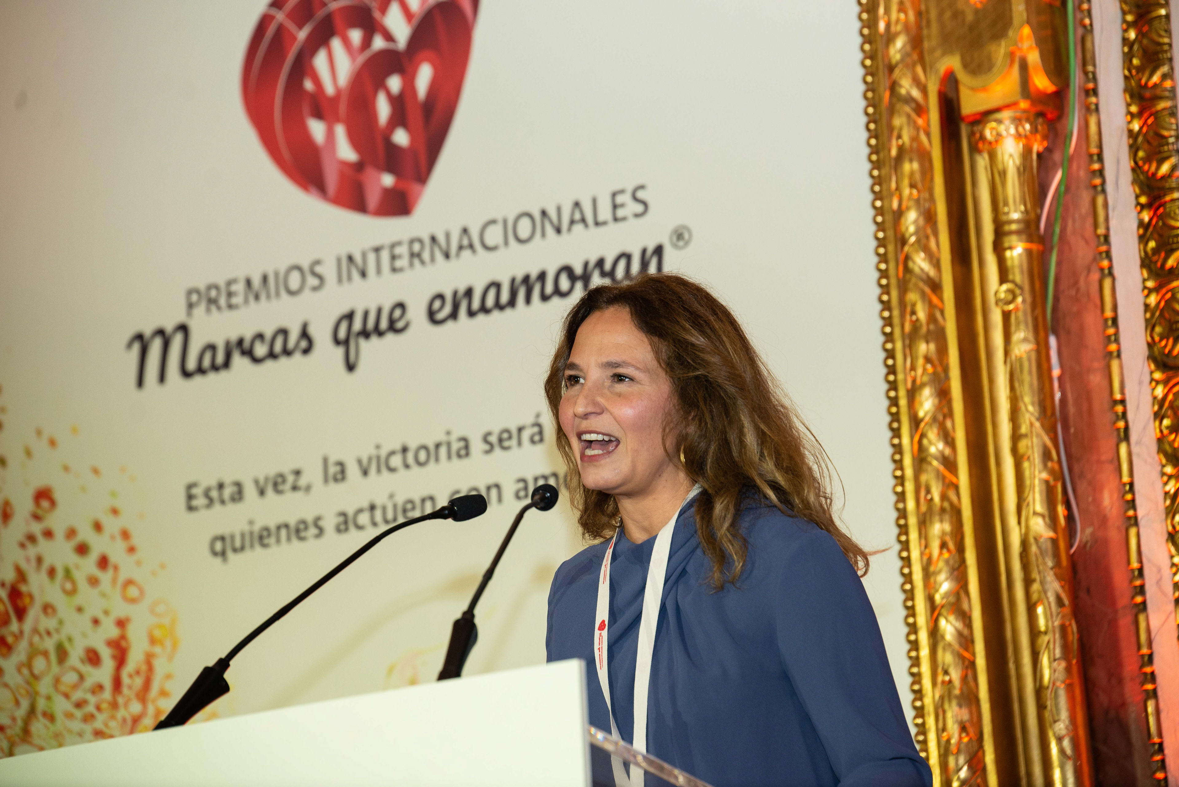
To ensure an optimal visual hierarchy, all sponsor logos were sized equally, with the organization's logo appearing larger to underscore its prominence. As a result, the primary logo occupied a more commanding presence in the room.
To ensure an optimal visual hierarchy, all sponsor logos were sized equally, with the organization's logo appearing larger to underscore its prominence. As a result, the primary logo occupied a more commanding presence in the room.
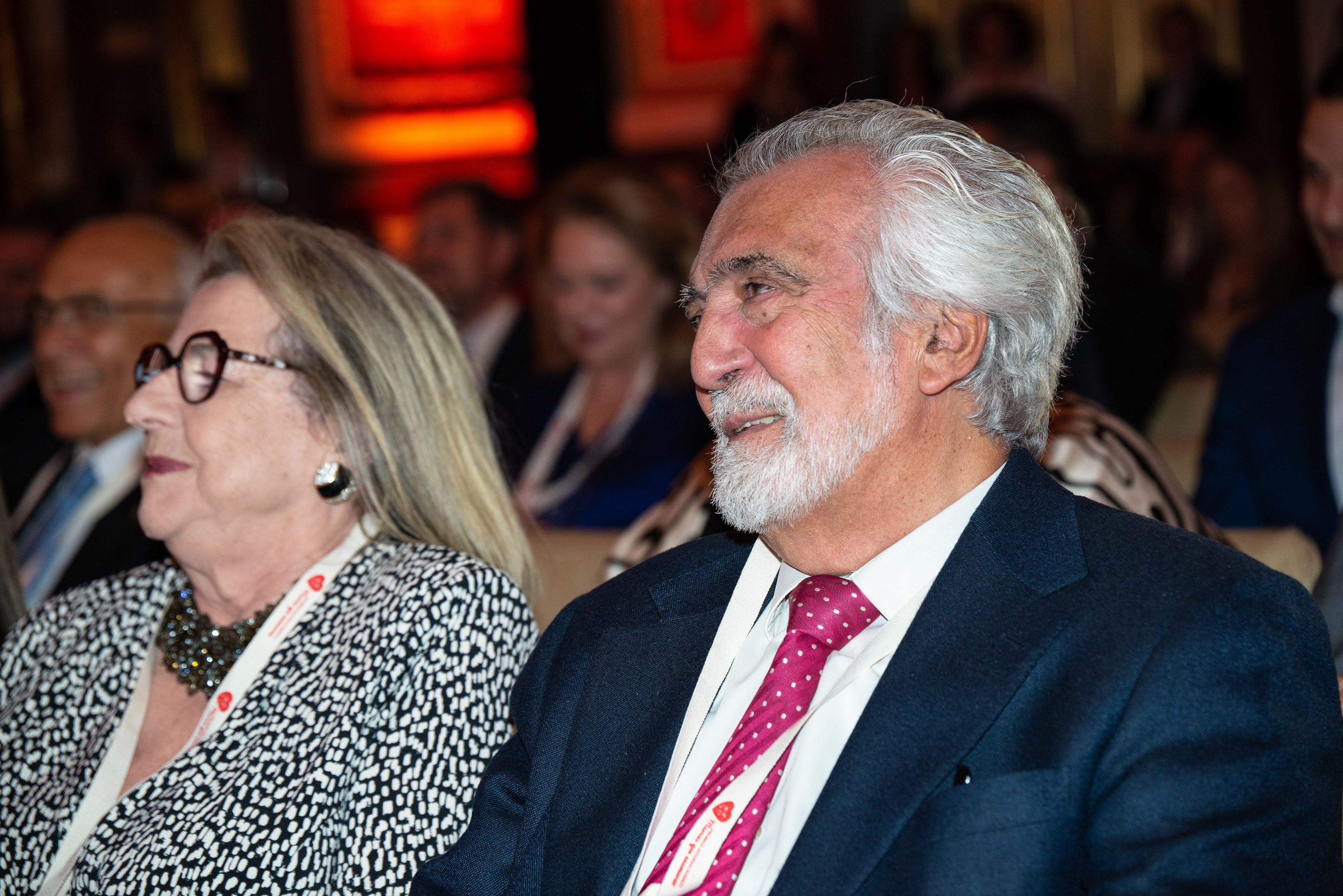
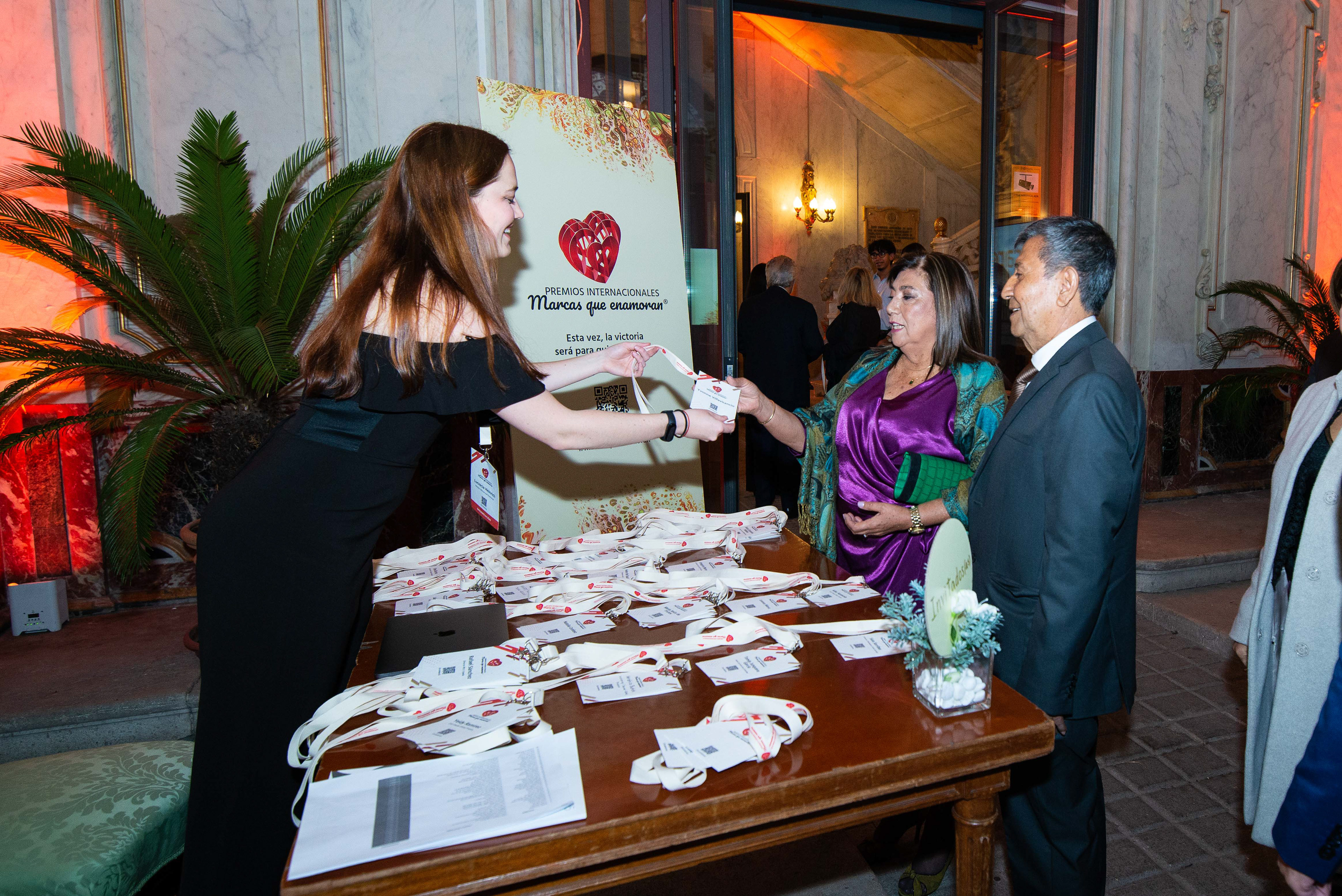
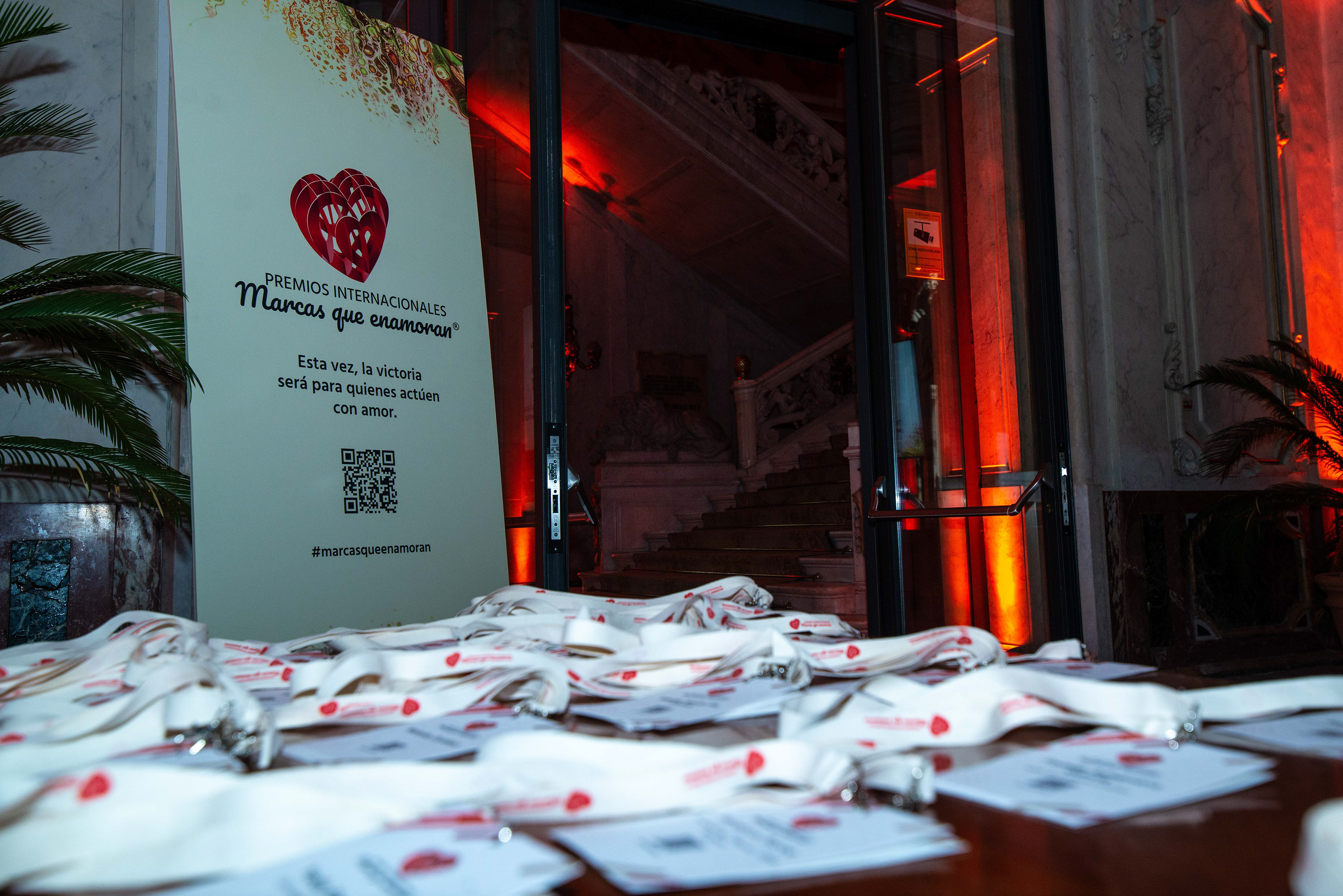
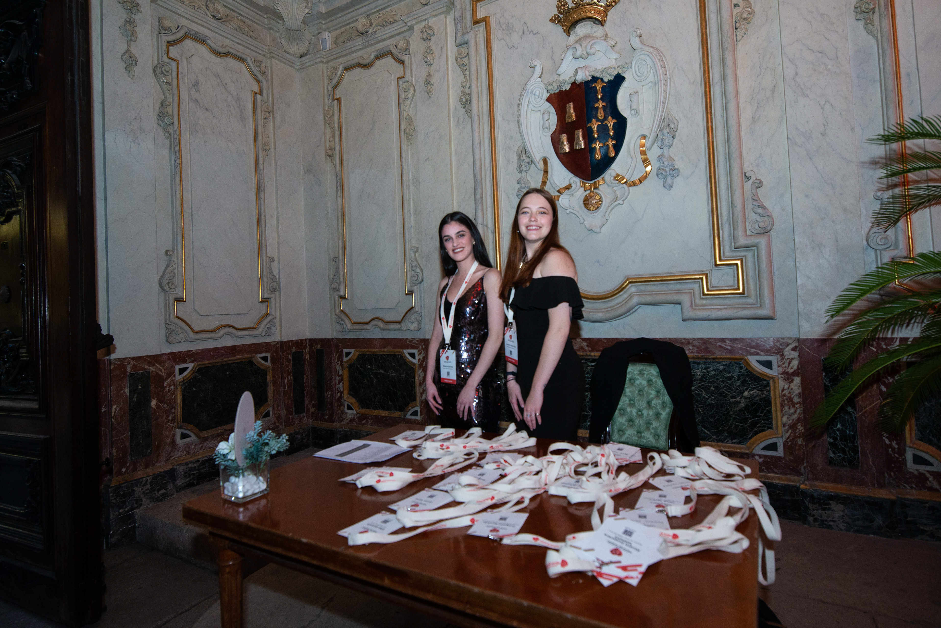
We not only had the main Graphic Design peace but also multiple designs in the whole palace. There were also credentials with each guests name in order for them to be able to expand their network in an easier way while interacting during the event. Furthermore, we encouraged guests to take home our biodegradable paper credentials, which could be planted to grow into beautiful flowers. Our approach to design was not only focused on aesthetics but also aimed to uphold the sustainability ethos of the event.

The whole event was a success and multiple newspapers and digital platforms shared the event reaching over 90 press coverage. Here is a summary of the impact caused https://marcasqueenamoran.es/premios-en-prensa/